

Top ten things to know/do/not do for your site
-
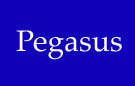
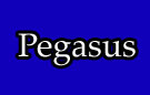
Don't have a flat area of a single colour unless that colour is black or white. If you want to make an area of another colour (e.g. blue), make it a gradient from that blue to a very similar blue. Even with a subtle colour change, the effect is quite noticeable.

Plain |

Gradient |
To use a gradient like this, you can easily just take a one-pixel sliver of the gradient image and repeat it. It should be about 200 bytes.
-
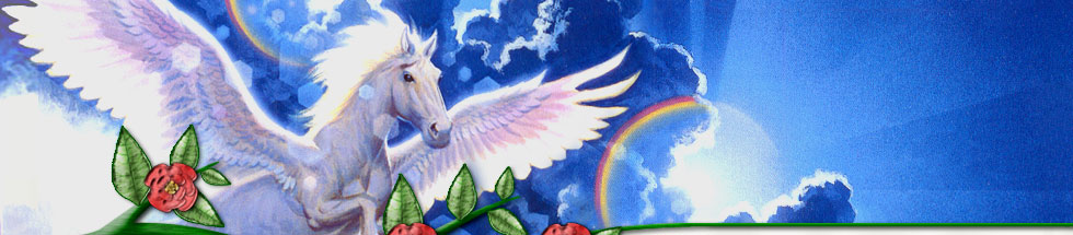
In short, nothing on your page, including lettering, should be 2-D. It should either be a photo, or be gradient-ed, textured, bevelled. Monotone areas (other than black or white) are simply not natural.
The only thing not 3-D on this page is the "Web Design & Photoshop Tutorials" text, and the two lines.
-
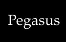
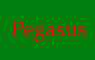
Give your site contrast by stroking (outlining) everything, especially if it's text over a picture. The only combination of colours I don't outline is black & white, or when the lettering is too small to be outlined.
|
Black/White: With black on white or white on black, which is what the body text of your site should be, the contrast is 100%. (You could even improve it by removing anti-aliasing (not) :) |
|
Green/Red: This is an intentionally bad combination of colours, but one I've seen before. |
|
Green/White/Red: With a bit of an outline, those colours come up very nicely. |
|
Blue/White: The contrast is pretty good here already. |
|
Blue/Black/White: Though putting this black outline in doesn't look bad, it makes the text harder to read, due to the increased complexity of the image. If the image were ten times bigger, the outline would be no problem. |

To see some good examples of outlining (or its absence), take a look at most chocolate bar wrappers. Their writing is pretty big, so they often sacrifice part of that size to give it multiple outlines.
On the other hand, newspapers and magazines often have text with no outline, to preserve simplicity, even at the cost of contrast (sometimes also to cater for the printing process).
-
Always optimise your images. Don't bother with gifs - I have only had one occasion where a gif was preferrable to a jpeg. Don't play around with the quality slider to cut down the filesize, just always use Quality 60, as that produces files with almost no visible quality loss, and 50% smaller file sizes.
The next installment of "things" will arrive shortly. :)