

"Moonbase" Website Layout – Page 2 of 2
The last half of this tutorial goes into adding the nice lighting effects, and putting on the finishing touches.
5 – Using channels to design web buttons
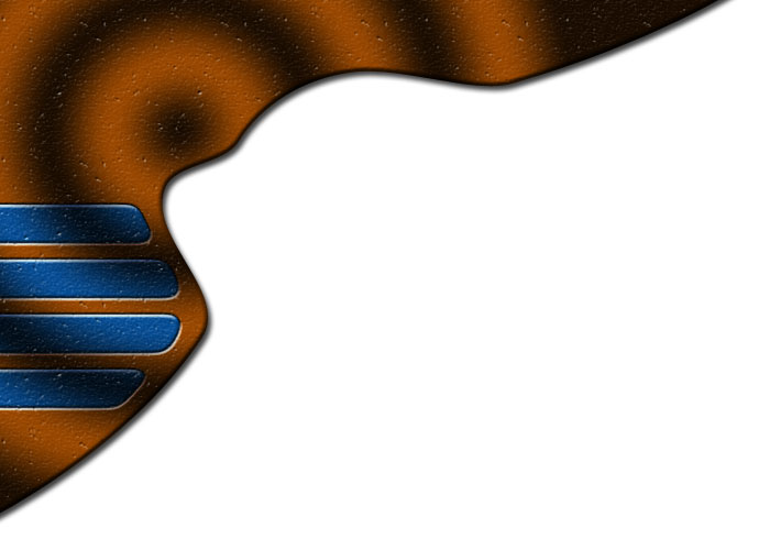
 Create a new channel. (Click Window > Channels, if you can't see the Channels window.) The screen should go black.
 Fill the selected area with white. (The shortcut to do this is Alt+Backspace.)
Press Ctrl+D to deselect.
Click Filter > Blur > Gaussian Blur. Set the Radius to 6 pixels.
Click Image > Adjustments > Levels (or press Ctrl+L). Move the black and white sliders almost to the centre of the histogram. You want your white areas to become rounded and smooth, but not blurry or jagged.
In the Channels window, Ctrl+Click on the new channel you've created. (You need to Ctrl+Click on the little thumbnail.)
Go back to the Layers window, and create a new layer, directly above your brown Shape Layer.
Fill the selected area with a dark grey. (I've used 575757 here.)
In the Layers window, change this layer's mode from Normal to Difference.
 Choose the Move Tool, and nudge the buttons to the left a bit, with the Left Arrow key. You can move the layer around to a better spot if it doesn't look quite right.
Right-click the layer, and click Create Clipping Mask.
6 – Adding cloudy light to the website menu
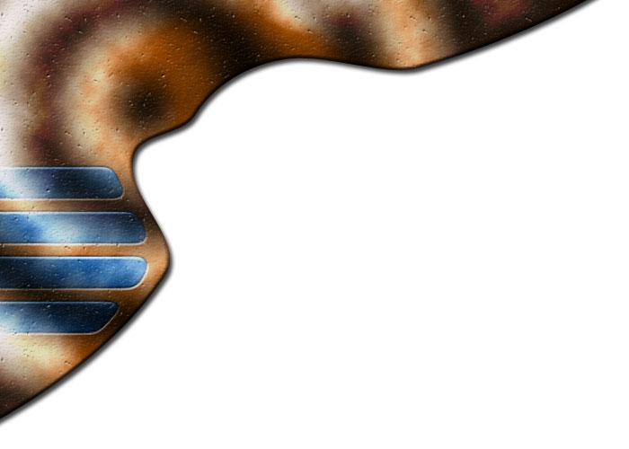
Create a new layer, directly above the layer with your blue buttons in it. Right-click this layer, and click Create Clipping Mask.
Press D to reset your colours to black and white.
Click Filter > Render > Clouds.
Click Image > Adjustments > Brightness/Contrast. Increase the Contrast to 24.
Change this layer's Mode to Hard Light, and its Opacity to 70%.

7 – Adjustment Layers
With any design, it's always a good idea to play around with the colours at the end. A website design can usually be improved with a bit of colour alteration.
 Above your existing layers, create a new Brightness/Contrast Adjustment Layer. Set the Brightness to 12, and the Contrast to 32.
Create a new Vibrance Adjustment Layer. Set the Vibrance to 60, and the Saturation to 10. (Vibrance is a new Adjustment Layer in Photoshop CS4. It increases colour saturation on less-saturated areas more, which stops the more-saturated areas of your image from becoming over-saturated. If you're using an earlier version of Adobe Photoshop, then just alter the Brightness/Contrast settings a bit more.)
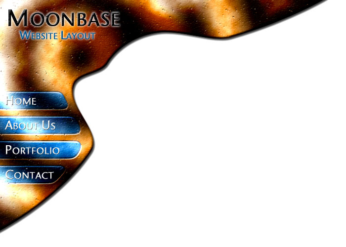
8 – Adding text to your web page header and menu buttons
I've used Beals Cocktail Font for the text on this layout. Century Gothic is an acceptable alternative here.
 Use the Type Tool to type in your header text. I've set the colour to black, and the font size to 40pt (except for the first letter, which is 50pt.)
Right-click this layer, and click Blending Options.
- Outer Glow (Set the colour to white.)
- Bevel (Style: Inner Bevel, Technique: Chisel Hard.)
- Texture (Pattern: Beige with White Flecks.)
Use the Type Tool to type in your sub-header. I've set the colour to blue (#005D9B), and the font size to 20pt (except for the first letter of each word, which is 50pt.) Right-click your header text layer, and click Copy Layer Style. Right click your sub-header text layer, and click Paste Layer Style.
Type in some white text on your first button. (Font size 20pt, with 27pt for first letter.) Press Enter, then type in the text for the next button. Do this until you've typed in all your button text.
In the Character window (Window > Character, if you can't see it), change the Leading (the "A" on top of another "A") to around 50, so that each of the lines of text lines up with a button.
Right-click this layer, click Blending Options.
- Bevel (Style: Inner Bevel, Technique: Smooth, Size: 1.)
 That's it. All you need to do now is to use the Slice Tool, to cut the image into a tall menu, and a wide header.
Click File > Save for Web and Devices, choose Jpeg, Quality: 60, and click Save.
In your web editor, you'll need to use a Hotspot or Image Map (depending on your web page editor), to make each of the buttons into a link.