

The Piglet Factory Website Tutorial
Follow the steps I took in Adobe Photoshop to create the fictitious "Piglet Factory" website.

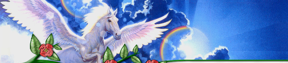
1 – New page & the green bar
In Photoshop, create a new Image, 500 pixels wide, and 300 - 500 pixels high.
 Select a long rectangular area.
 Choose the Gradient Tool, and use it to fill the area with a gradient from very dark green to a midtone green. (I chose green here, firstly because it's nice to get away from blue, and secondly because dark green and dark purple are excellent for giving a regal appearance.)

2 – The yellow text
 Using a serif (curly) font (Times New Roman, or preferably Palatino Linotype), type in your heading.
If the option is visible, change the "Tracking" from 0 to about 500, to space the letters out. For PS 5.0 users (or lazy people :), you can just type out your words, and then repeatedly press Right Arrow, Space.
Double-click the layer, and give the text a Drop Shadow, and a Stroke (outline). Outer Glow is the nearest Photoshop 5.0 equivalent of Stroke. You can set the outline to 50% Opacity to tone it down if necessary. If you're using Photoshop 6.0 or 7.0, you can also add a Gradient Overlay (set the gradient to "Overlay", not "Normal", and make its direction north-south on the little dial.)

3 – The Picture
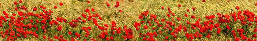
Unless you have stock photography CD's or a picture you'd like to use, find yourself a nice picture, such as these flowers.
Preferrably without stretching or enlarging it, crop it and put it at the top of your image.

4 – A pearly menu bar
After the vivid colours of the other two elements, another colourful bar would look bad here.
Select the area for the bar.
 Fill the area with yellow (any yellow will do). Leave the area selected afterwards.
 Make a new layer.
Fill the selected area with a black-white-black gradient. To do this, click the gradient tool and select the "Reflected Gradient" option – it's the one that looks like the side of a steel tube. Switch your colours so that white is your foreground colour and black is the background colour. Once you've done that, click and drag from the centre of the bar to the top (Hold down Shift to make it perfectly straight.)
Change this new layer from a Normal layer to an Overlay layer.
Go to your yellow layer, and press Ctrl+U to change its Hue/Saturation properties. Using the sliders in the pop-up window, decrease the saturation, and increase the brightness (alter the hue a bit too if you like). Do this until you're happy with the colour of your bar.
For the text, I used black size 12 Lucida Sans Unicode, with strong anti-aliasing. Between each word, put two spaces, then a "|" (Shift-Backslash).

5 – Areas that don't match
Because people's screen resolution is probably not 500 pixels wide, you need the flowers to continue on either side of the header, to fill up the whole width of the screen. If you just put a repeating background for the header cell, the flowers at the end of one repetition wouldn't match those at the start of the next repetition. (Have a look at the diagram - if I were to simply repeat the header several times, the A section would join to the B section, and it wouldn't quite match up, leaving a visible line.)

6 – Making the image tile-friendly
Use the Selection tool to select half the header image. Right-click the area, and click "Layer via Cut" if you can. Instead, you can always just press Ctrl+C and then paste it on a new layer with Ctrl+V.
 In the diagram, I've used the Move Tool to swap these layers over.
Notice that the parts labelled "Z" were together, and if they are put back together now, everything will match up perfectly.
There's still an obvious join-line here, but it's in the middle (note that the ends now match up perfectly). In the middle of the image, it can be worked on easily.

7 – The tiling line, Before and After
Zoom in, by pressing Ctrl and the plus key.
 Choose the Clone Stamp Tool (Hotkey: S). Click on what you want to "Clone", and then start drawing somewhere else, and the brush will copy the picture from where you clicked at first, to where you're clicking now.
To extend the green grass at the very bottom, I clicked the clone brush on the grass, and then started drawing new grass to the left of it.
In the centre, I used the brush to extend a flower from the right to the left, and another one in the opposite direction.
In the top left-hand corner, I also cloned a bit of grass from the top centre, to help cover up the line where it changes from green to brown.
![]()
![]()
8 – Separating the images and creating slivers
For this step, it's also possible to use the Slice Tool, if you have Photoshop 6.0 or 7.0.
If you're using Photoshop 5.0, one by one, select each element (pictorial header, title bar, menu bar), and click Image > Crop to cut everything else off.
Click File > Save For Web. Choose Jpeg, Quality 60. If necessary, also save a one-pixel wide vertical sliver of that picture, as shown above. After you've done each area, use the History to undo your steps, until everything is uncropped, and you have your original image.
9 – Creating the web page
In your web editor, create a table with five rows, and one column. Set the table to 100% width, with no cell borders, padding or spacing. Set the Page margins to 0.
Set the top cell to have your flowery grass as the background. Set the background of the next cell to be the sliver of your green menu. Then put the actual menu image in that cell, and centre it. In the next cell and the very bottom cell, repeat this process for the menu and its sliver image.
Now, the web page layout will expand to seamlessly fill the full width of the screen, regardless of how wide the screen is.